Styling updates
Import a couple CSS tweaks into Slack.
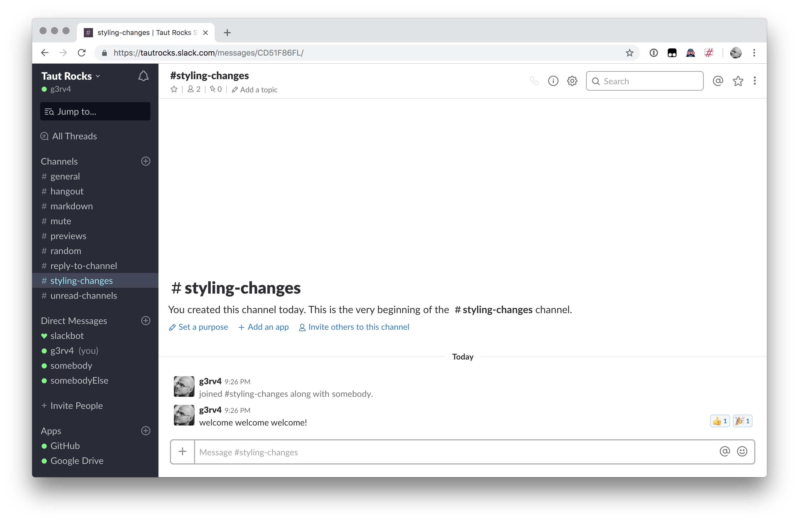
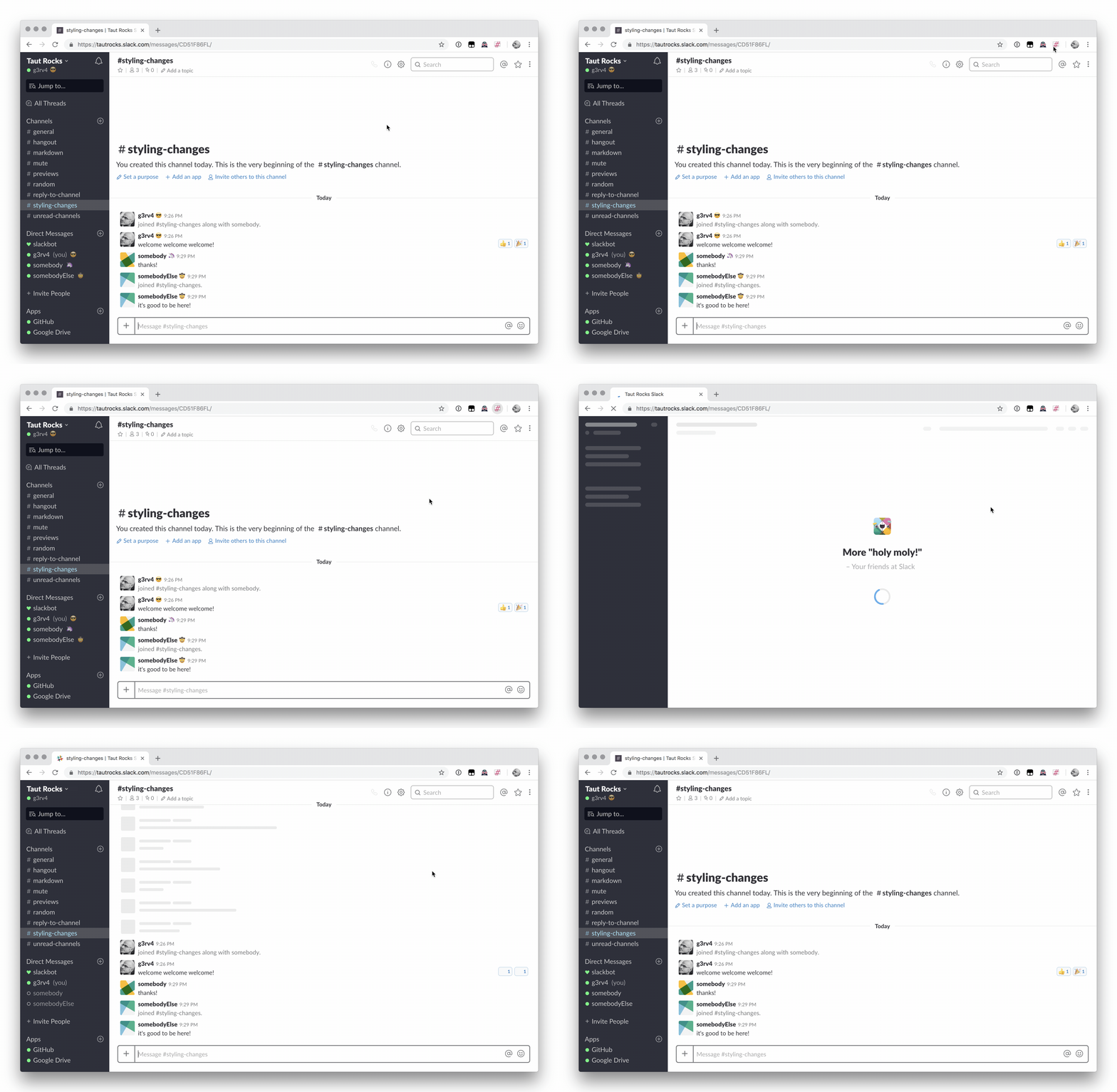
Reactions can take some vertical space, increasing the scroll you have to do to actually see what's going on. With this feature, Slack now looks like this:

Do you find the status emojis distracting? You can disable them!

Why? Because you can! here's how it looks:

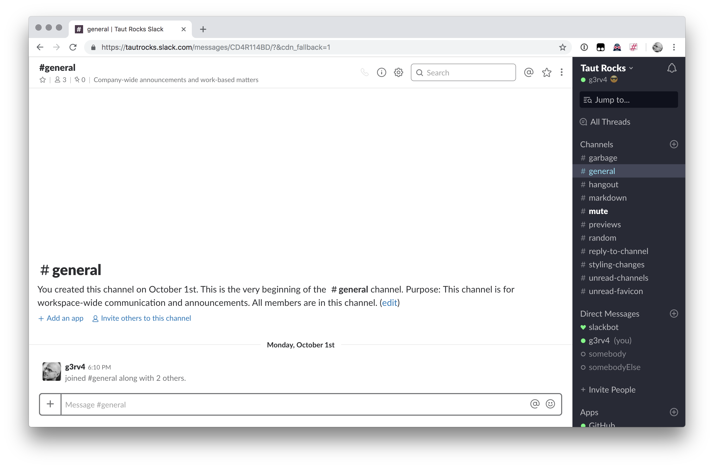
I can see what's unread... I don't use All Unreads at all.
Same thing... I don't need all threads at all.